TÜGA
Corporate Identity & Logo Design
We designed the logo and corporate identity of an association building cooperation between two countries, applied as one consistent language across print, environmental and digital surfaces.
- Client
- TÜGA
- Category
- Brand Identity & Corporate Design
About the Project
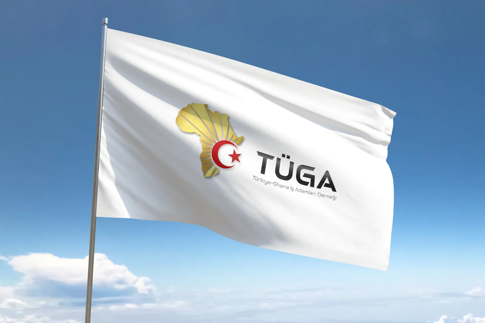
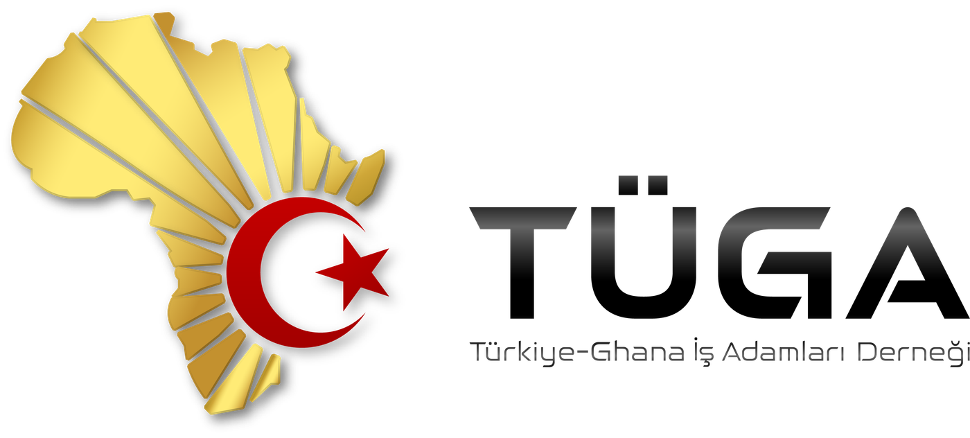
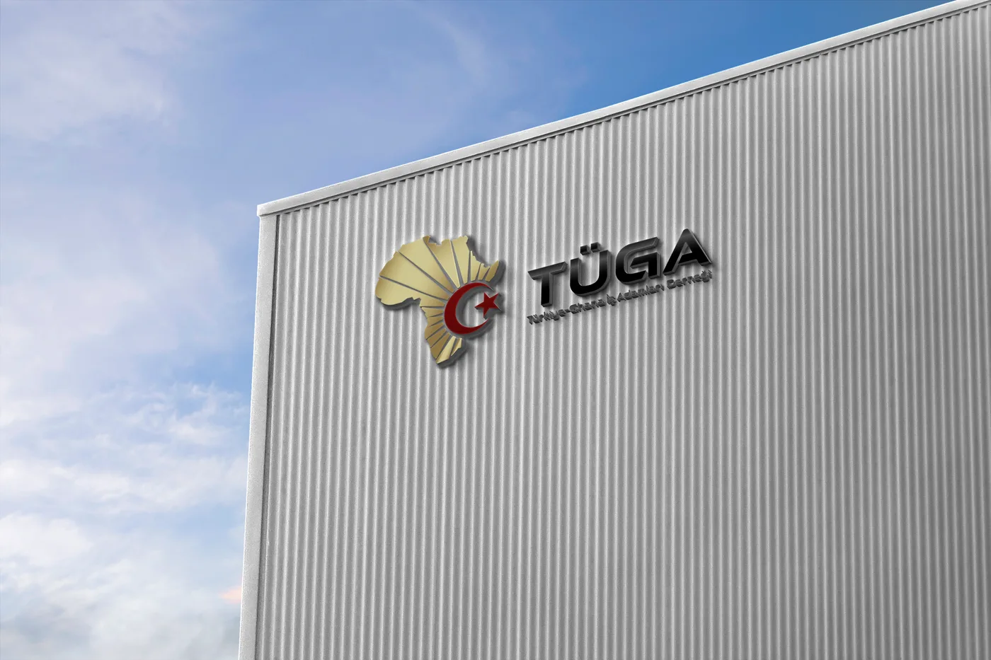
TÜGA — the Türkiye-Ghana Business Association — describes itself as an association working to strengthen cooperation between the two countries, support development and create opportunities in the business world. TURQUOIZE designed the association's logo and corporate identity. The brand mark unites the association's bridging role between two geographies in a single symbol: a gold Africa silhouette interlocked with the Turkish star and crescent. The identity was prepared so that the same mark and typographic system carries from corporate stationery through to environmental applications.
Need / Problem
An association bringing two countries together needed a visual identity that reads correctly in both geographies and carries institutional seriousness. The identity had to work not only as a logo but without degradation across very different scales and production techniques — from corporate correspondence and business cards to flags and building signage.
Work Delivered
- Logo Design
- Corporate Identity Design
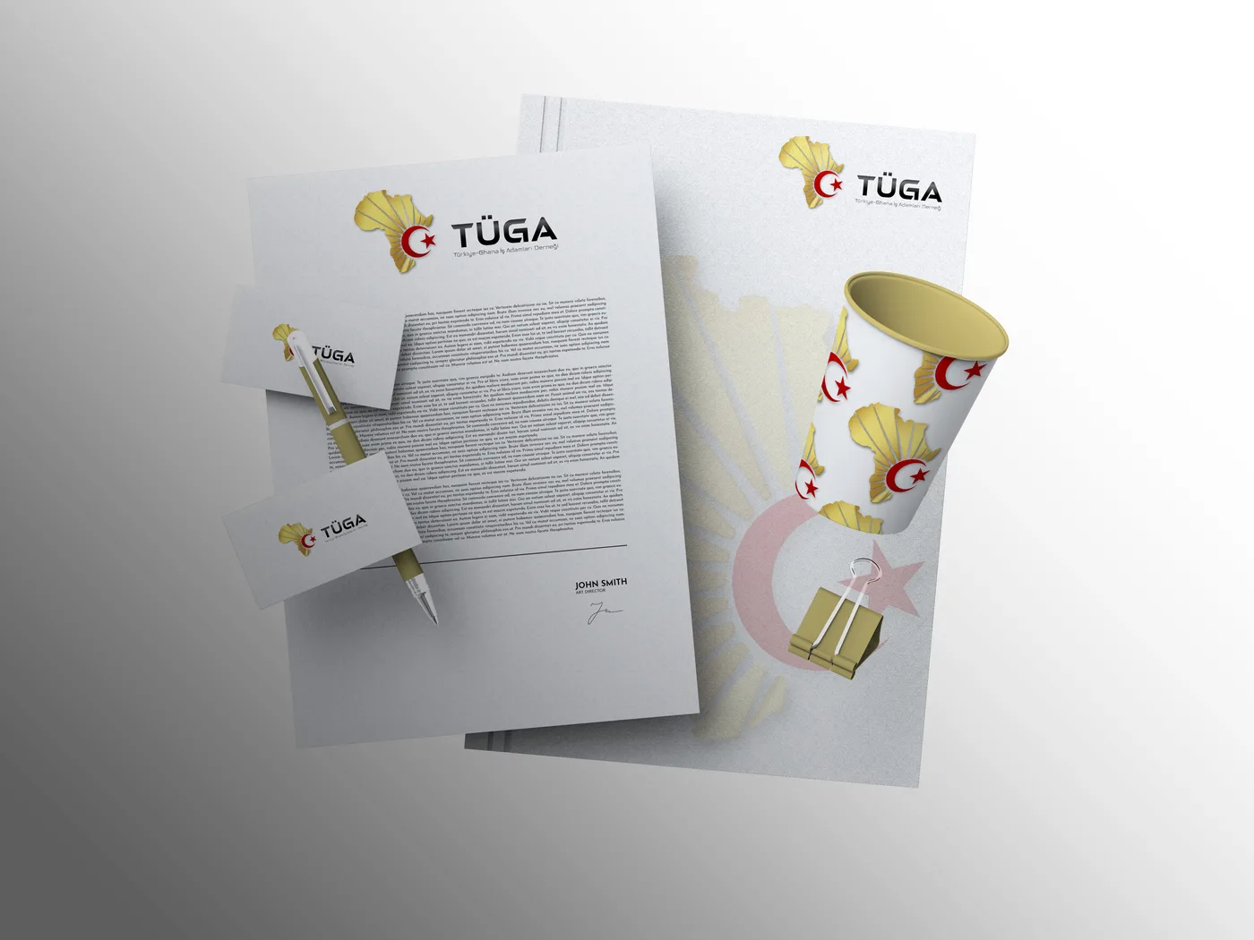
- Corporate Print Material Design (letterhead, business cards)
- Environmental & Promotional Applications (flag, building signage)
- Logo Variants for Print and Digital Use (CMYK / RGB)
Project Gallery
The Brand's Digital Presence
A selection of posts published on the brand's own official social media account. The content was shared by the brand; follow a post to see it at the source.
 View post
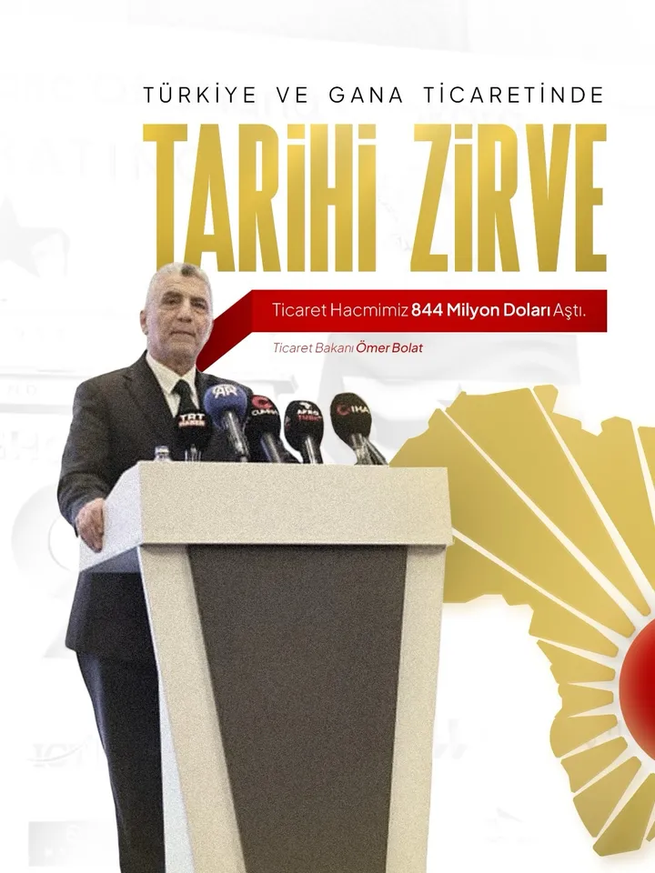
The association's post on the trade volume between Türkiye and Ghana and the deepening cooperation between the two countries.
 View post
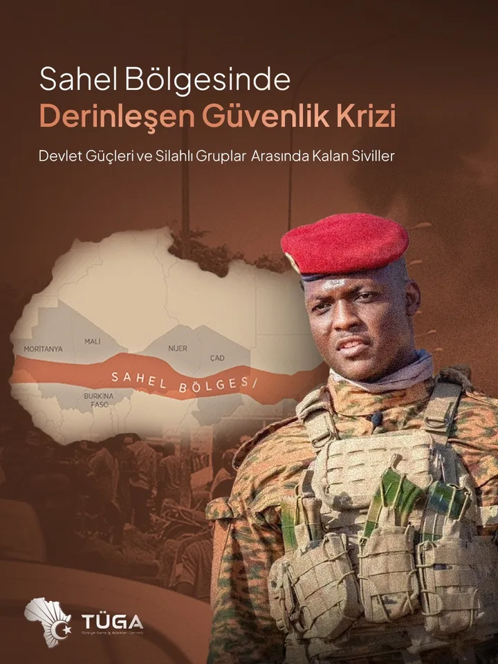
An analysis post on the security crisis in the Sahel and Ghana's role as a stabilising force in West Africa.
 View post
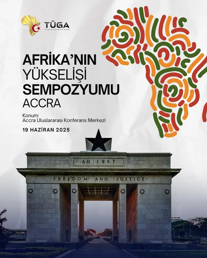
Announcement of the "Rise of Africa Symposium" held at the Accra International Conference Centre.
 View post
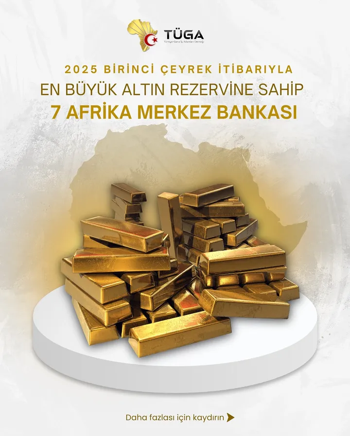
An informational post compiling the central banks holding the largest gold reserves on the African continent.
Result
The project gave TÜGA a brand identity that expresses its position between two countries in a single mark: the gold Africa silhouette interlocked with the star and crescent communicates what the association does before a word is read. The identity was applied with the same recognisability across very different scales — from corporate correspondence and business cards to flags and building signage — and the separately prepared colour variants for print and digital use (CMYK and RGB) keep the mark consistent on every surface, from the press to social media. As a result, the association carries one coherent corporate appearance across different countries and different communication environments.
Let's Discuss Your Project
View All